
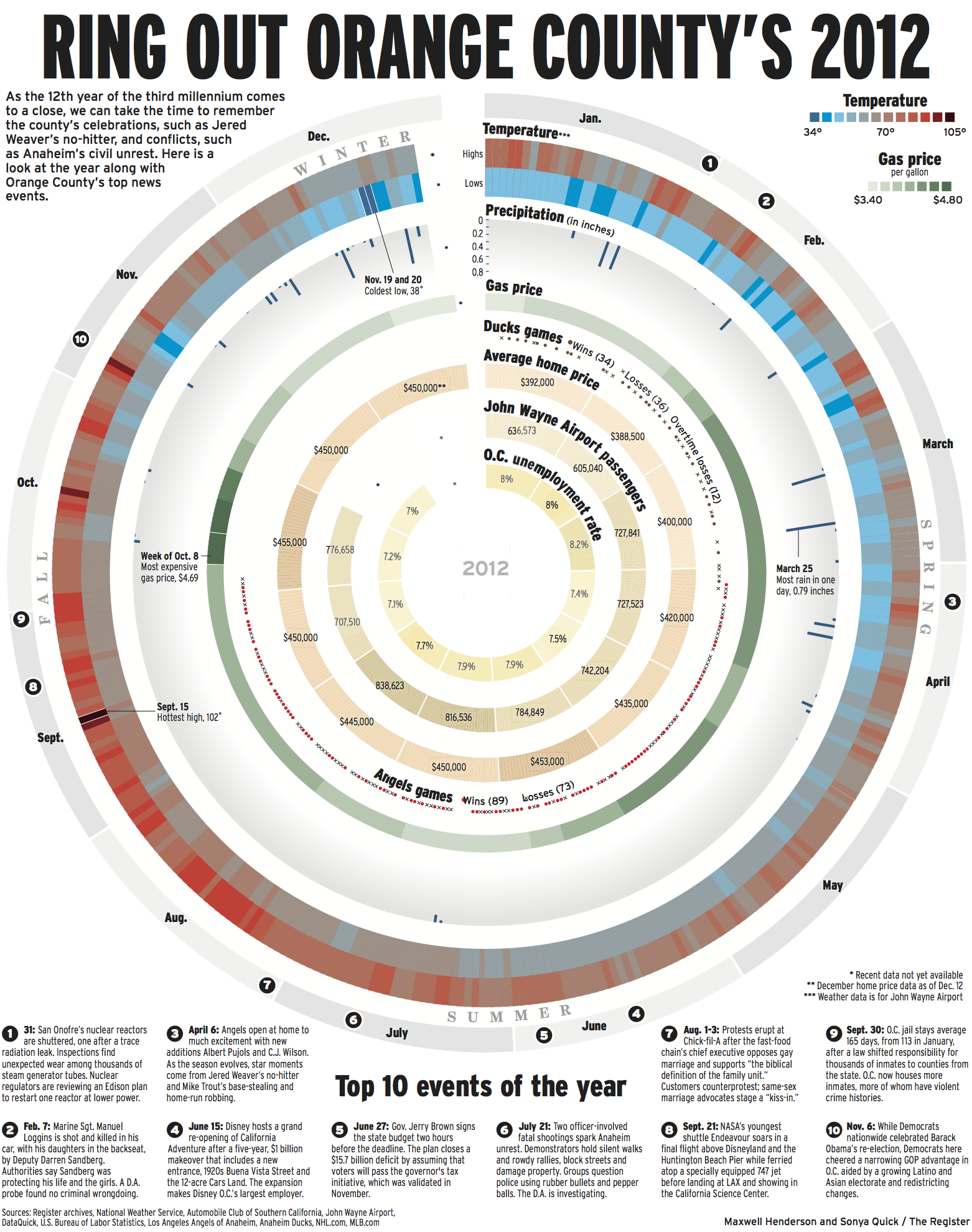
I first got the idea for this graphic when I saw this website that shows the average color of the New York sky, updated every 5 minutes and based on webcams.
I wondered if there would be a way to visualize Orange County’s sky over the course of, perhaps, a year. I started by searching for weather data for the year. Then I thought we could attempt to show the county’s year through data – and to weave it all together in a circle. Artist Maxwell pulled it all together visually.